Emms, Two Mūlasarvāstivādin Vinaya Traditions (2012)

Christopher D. Emms. Evidence for Two Mūlasarvāstivādin Vinaya Traditions in the Gilgit Prātimokṣa-sūtras. M.A. thesis, McMaster University, 2012. 127 pp. Open Access Dissertations and Theses, Paper 7337. [URI/PDF]

From the abstract

The Sanskrit prātimokṣa-sūtras contained in the Gilgit Buddhist manuscripts have been identified as belonging to the Mūlasarvāstivāda school. However, the identification of these manuscripts as Mūlasarvāstivādin texts is problematic. A key factor for determining the school affiliation of a prātimokṣa is the rule order. The Gilgit prātimokṣa-sūtras, however, differ in their rule order. In this thesis, I explore the relationship of these Gilgit prātimokṣa-sūtras to Mūlasarvāstivādin literature. […] I argue that we have evidence for two distinct Mūlasarvāstivādin Vinaya traditions within the Gilgit prātimokṣa-sūtras.

Allon, ‘A Gāndhārī Śrāmaṇyaphala-sūtra’ (2013-04-05)

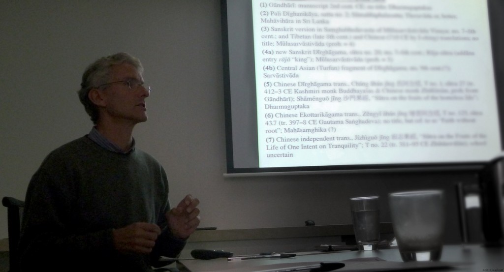
Mark Allon. ‘A Gāndhārī version of the Buddha’s Discourse on the Fruits of Living the Ascetic Life (Śrāmaṇyaphala-sūtra)’. Australasian Association of Buddhist Studies Victoria Seminar, 5th April 2013, Deakin Prime Campus, Melbourne.

Abstract

The Senior collection of Gandhāran Buddhist manuscripts includes a scroll which contains a Gāndhārī version of the introductory section of the Śrāmaṇyaphala-sūtra, the Buddha’s discourse to King Ajātaśatru on the benefits of living the ascetic or holy life. The appearance of a Gāndhārī version of this interesting and popular sūtra coincides with the appearance of a second Sanskrit witness of it, namely, that included in the new Dīrghāgama manuscript, which preliminary research indicates is similar to but not identical with the Sanskrit version found among the Gilgit manuscripts. We therefore now have Indic versions of the Śrāmaṇyaphala-sūtra in Gāndhārī (albeit incomplete), Pali, and Sanskrit, a Tibetan translation and four Chinese translations, which belong to a diversity of schools and originate from different times and places. Not surprisingly the Gāndhārī sūtra is not identical to any other version, but shows a complex relationship with them. In this paper I will discuss the Gāndhārī version of the sūtra and its relationship to the parallels in other languages, the possible reasons for its popularity, and the likely reasons for its inclusion in the Senior collection.

Dr Mark Allon
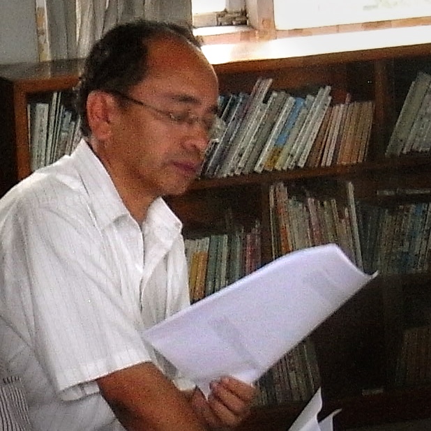
Dr Mark Allon (photo © I. S.)

Facsimile Edition of All Palmleaf MSS in the TAR (2012?)

བོད་རང་སྐྱོང་ལྗོངས་སུ་ཉར་ཚགས་བྱས་པའི་ཏ་ལའི་ལོ་མའི་དཔེ་ཆ་ཀུན་བཏུས་པར་མ།
《西藏自治区珍藏贝叶经影印大全》(共61分册)
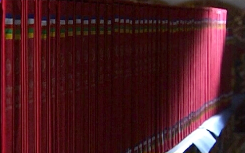
*Facsimile Edition of Palmleaf Manuscripts in the Tibet Autonomous Region: Complete Collection. 2012(?). 61 vols.

བོད་རང་སྐྱོང་ལྗོངས་སུ་ཉར་ཚགས་བྱས་པའི་ཏ་ལའི་ལོ་མའི་དཔེ་ཆ་ཀུན་བཏུས་ཀྱི་དཀར་ཆག་བསྡུས་པ།
《西藏自治区珍藏贝叶经影印大全简目》
*Facsimile Edition of Palmleaf Manuscripts in the Tibet Autonomous Region: Complete Collection. Brief Index. 2012(?).

བོད་རང་སྐྱོང་ལྗོངས་སུ་ཉར་ཚགས་བྱས་པའི་ཏ་ལའི་ལོ་མའི་དཔེ་ཆ་བྲིས་མའི་རྩ་བའི་དཀར་ཆག།
《西藏自治区珍藏贝叶经总目录》(共4册)
*Master Catalogue of Palmleaf Manuscripts in the Tibet Autonomous Region. 2012(?). 4 vols.

61-volume Facsimile edition of Palmleaf MSS in the TAR (via Tibet TV)
Palmleaf MSS in the TAR, 61 volumes (via Tibet TV)

Continue reading “Facsimile Edition of All Palmleaf MSS in the TAR (2012?)”

Modular Infotech’s Unicode Devanāgarī fonts

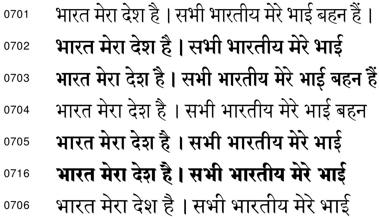
High-quality Devanāgarī fonts suitable for professional typesetting are still hard to come by. One foundry producing fonts to something like the required standard is Pune-based Modular Infotech. They offer true bold faces and true italics. Refer to their specimen (published 2004, but apparently still current):

Modular Infotech Typefaces Catalog (2004:2)

Since I haven’t used any of Modular Infotech’s fonts at the time of writing – they don’t come cheap – this is not yet a recommendation. Meanwhile, it’s possible to do some limited testing at fonts.com by clicking ‘TRY IT’ and typing a Unicode Devanāgarī string.

Rashtriya Skt Sansthan, Saṃskṛtanāṭyaviṃśatikā (2010)

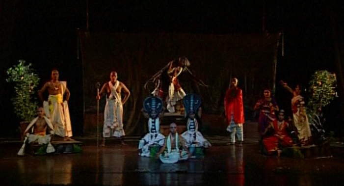
Rashtriya Sanskrit Sansthan. Saṃskṛtanāṭyaviṃśatikā: Twenty best Sanskrit plays in performance. New Delhi: Rāṣṭriyasaṃskṛtasaṃsthānam, 2011(?). 20 videodiscs.

Contents: (1) Jāgarūko bhava (2) Sabhikadyūtakaram (3) Bhagavadajjukīyam (4) Karṇāsvatthāmīyam (5) Cārudattam (6) Campakarāmaḥ (7) Nāgānandam (8) Madhyamavyāyogaḥ (9) Mattavilāsaprahasanam (10) Svapnavāsavadattam (11) Hāsyacūḍāmaṇiprahasanam (12) Pratijñāśvatyāmīyam (13) Abhiṣekanāṭakam (14) Mālavikāgnimitram (15) Tripuradāhaḥ (16) Pañcakalyāṇī (17) Āścaryacūḍāmaṇiḥ (18) Sītācchāyam (19) Ekapātrābhinayaḥ (20) Kauravauravam [sic].

'...सेर्ष्यं मारवधूभिरित्यभिहितो बोधौ जिनः पातु व' (नागानन्दम् १.१)
‘…सेर्ष्यं मारवधूभिरित्यभिहितो बोधौ जिनः पातु वः’ (नागानन्दम् १.१)

Park, Korean-Chinese-Sanskrit-English dictionary (2012)

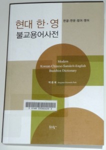
Park_2012_cover-med박 종매 (Pak Chong-mae). 현대 한·영 불교용어사전 (Hyeon-dae Han-yeong Bul-gyo yong-eo sa-jeon). 푸른 향기. 2012-05-19. 28,000원 [official announcement]

Jongmae Kenneth Park. Modern Korean-Chinese-Sanskrit-English Buddhist dictionary. Seoul: Prunbook Publishing, 2012. 642 pp. ISBN 9788992073929.

The Sanskrit terms are typeset without diacritics, unfortunately. A scholarly Buddhist dictionary of Korean and Sanskrit is yet to be produced.

KL Dhammajoti, Reading Buddhist Sanskrit Texts (2012)

Kuala Lumpur Dhammajoti. Reading Buddhist Sanskrit Texts. An Elementary Grammatical Guide. Hong Kong: Buddha-dharma Centre of Hong Kong, 2012. ix + 361 pp. ISBN 978-988-16820-1-7 [available from Swindon Books]

A book that finds and almost fills its niche. Some weirdness is apparent, like the fact that sentences in romanized transcription do not appropriately add white space after finals. There are numerous typos and mistakes in sandhi, and there are no keys to the exercises — always a severe limitation. However, a patient and competent reviewer could easily detect, report and fix most of these problems. Any effort to knock down the high walls erected around the study of Sanskrit in ‘the West’ is, of course, worth encouraging.

From the Preface

“There are many excellent Sanskrit primers […] However, they all share the common feature of being based on non-Buddhist sources […]
many Buddhist students […] need to spend a large amount of time getting acquainted with those texts which are neither their concern proper nor source nor inspiration […]. It is out of this consideration that […] I had been thinking of producing an elementary manual totally based on the Buddhist texts” (p. v).

Min Bahadur Shakya, 1951-2012

मीन बहादुर शाक्य जु
हिरण्यवर्णमहाविहार (क्वा बाहा) अवस्थित, यल
जन्म मिति— ने. सं. १०७१ (वि. सं. माघ ४, २००७)
दिवंगत मिति— ने. सं. ११३२ (वि. सं. आश्विन २, २०६९)

Pandey’s Siddham Script in Unicode proposal (2012/8)

Anshuman Pandey. ‘Proposal to Encode the Siddham Script in ISO/IEC 10646’. ISO/IEC JTC1/SC2/WG2 N4294 L2/12-234R. PDF. 2012/08/01.

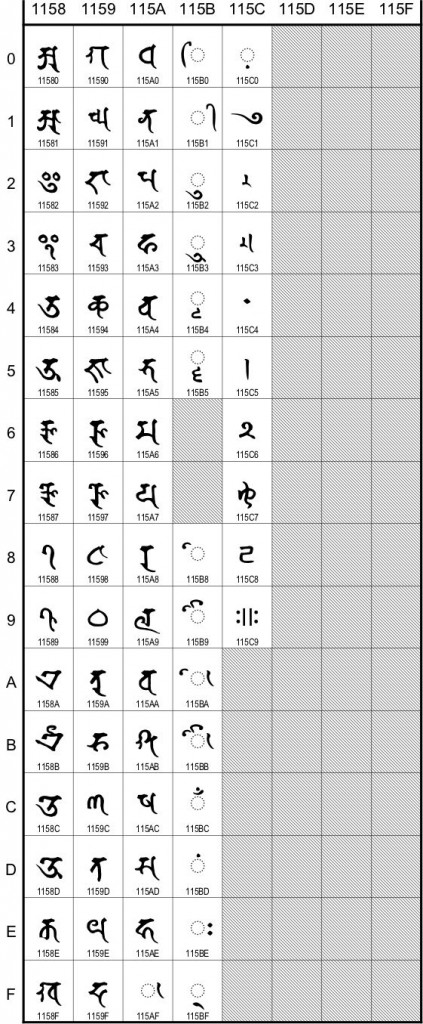
Mr. Pandey’s proposal – now no longer preliminary – promises to fill yet another gaping hole in the standard encoding of important Indic scripts. Now would be an appropriate time to comment, if you haven’t already commented.

(I would hope, at minimum, for the addition of a full set of ten digits in the final proposal. Often such basics fall through the gaps because the corpus of readily available primary material is so limited. Here‘s a nice “7-8th century” bilingual manuscript with a varṇamālā (no digits, though) which is both in good condition and readable online, thanks to the care of its Japanese custodians. Incidentally, this clearly confirms that two of the “Punctuation and ornaments” in Pandey’s Fig. 33 are ornamental final anusvāra [अं字].)

Comments should be emailed to Anshuman Pandey, whose address is given in the N4294 proposal (link above) and at the bottom of his personal website (link).

ISO/IEC JTC1/SC2/WG2 N4294 Fig.1. Proposed code chart.

Source Sans Pro: An open source Unicode font that works

A new and ambitious font, Source Sans Pro, which has glyphs in the Latin Extended Additional codeblock (required for most Indological publishing in Unicode), was released by Adobe earlier this month.

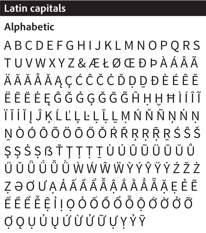
Why ambitious? Because free, open source, high quality and produced by a stalwart of design in the digital era, all at once. Its letterforms riff on News Gothic, a typeface of enduring appeal. And it comes with an inspiringly comprehensive set of weights, from Extra Light to Black, and true italics. Anyone who knows what a proper font needs to have will know how rare and remarkable this is. Although it’s optimised for user interfaces, I’ve tested it in XeTeX and found that it works superbly. Here’s a snippet of how it looks, from the specimen:

Source Sans Pro Capitals, regular weight (specimen, p.9).

What’s the catch? None other than the fact that just by using it and pulling apart the source, you might be more inclined to contribute to its development. A reason for releasing the font as open source (and hence free) is to demystify the increasingly complicated process of creating multiple-weight Unicode OpenType fonts, thereby encouraging the production and proliferation of fonts that meet contemporary standards. Open source lets all that complexity communally come to light, as Paul D. Hunt (and his commenters) reveal in Adobe’s official announcement of the font.

It’s downloadable from SourceForge.