Paul D. Hunt. ‘Language and region specific considerations for Devanagari typography. Case studies in Sanskrit, Hindi, Marathi, & Nepali’. M.A. Thesis, University of Reading, September 2008. [PDF]
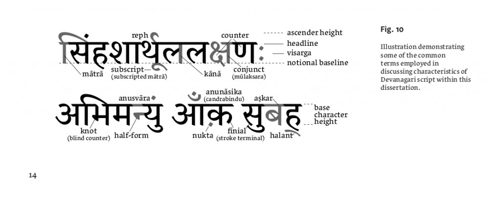
Reading, England, produces more than just atheist comedians; the University of Reading also awards respected higher degrees in Typeface Design. Hunt’s M.A. thesis, set in elegant Grandia, explores a few of the varied functions that Nāgarī type may be called on perform. It’s potentially useful reading for those working on Sanskrit texts who have dreamed of a better Unicode typeface, and who seek the typographical vocabulary to articulate exactly what they are looking for.

The current situation is far from perfect, of course. Of the Unicode Nāgarī faces out there at the moment, I could only recommend two or three, at most, for serious philological typesetting. It is frustrating that adequate faces are not even available to buy, for the most part.
I don’t agree with Hunt on everything, like his frequent use of the lacklustre Saral font. The manuscript writing sample shown on p.6 actually features the Nepalese script better known as pracalita, not devanāgarī. If anything, his work shows just how much specialist expertise is needed to create a workable typeface. Dan Reynolds’ 2008 Masters’ thesis on Hindi newspaper types [PDF], and Fernando de Mello Vargas’ on Tamil (2007) [PDF], products of the same program, can be viewed as companion studies to Hunt’s dissertation.

